Home
This tab displays information regarding email authentication performance for your domain.
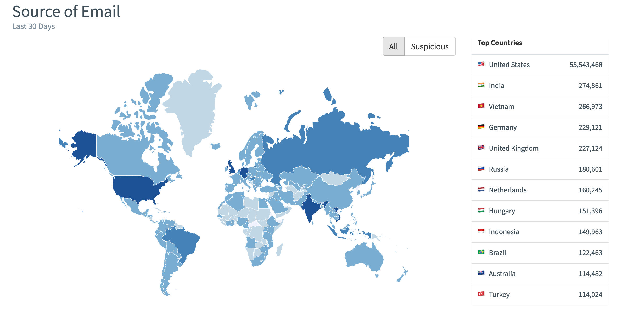
Source of Email
This world map shows the source of emails being sent through your domains for the past 30 days. You can click the selector to view the information for All or Suspicious emails. You can hover on each country on the map to see the total number of messages sent, or hover on each country in the list to see a detailed breakdown.
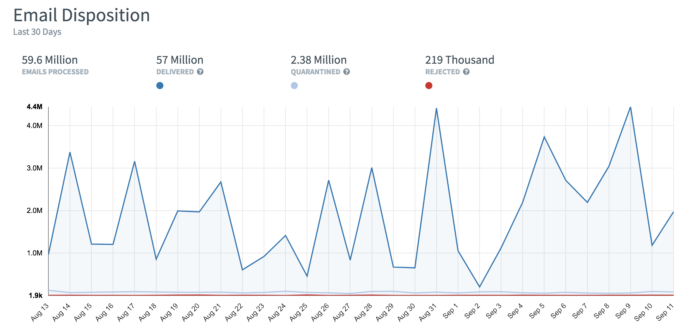
Email Disposition
This chart displays the trend over the last 30 days for how many emails were delivered, quarantined, or rejected. You can select or deselect each category by clicking the respective colored button to adjust the chart. For example, you can deselect the Delivered category in order to focus on the Quarantined and Rejected categories.
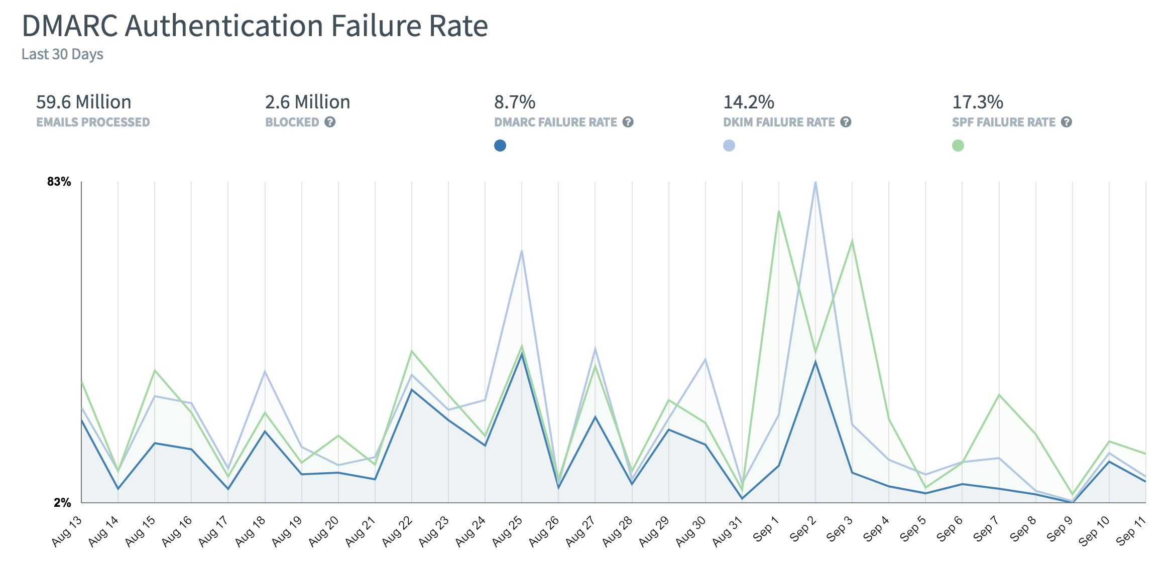
DMARC Authentication Failure Rate
This chart displays the trend over the last 30 days for email authentication by DMARC. You can select the failure categories to check the correlation between DMARC, DKIM, and SPF failures.